Many of my clients love the 12 seasons approach or have custom seasonal palettes already and I am happy to work with whatever color approach they are enjoying, while using it in a way that meshes with Fantastical Beauty. When a client comes to me without a palette in mind, I create a custom color space for them (If you are looking for someone to situate you within a 12 seasons approach, Rachel Nachmias of Best Dressed is SciART trained, with an exquisite eye, and I heartily recommend her). The following is entirely my own opinion and reflective only of the Fantastical Beauty system.
All systems approaches to style and color are going to be springboards for finding your absolute best styles and colors. These aren't often endpoints, but rather best taken as beginnings. Might some people fit perfectly into the stereotype of a season or archetype? Absolutely, but assume they are a rarity. Most people need to take the box that fits best and begin hammering at it until it truly fits. Don't be afraid to remove sections while expanding others.
I see people taking their palette (from a variety of systems) or style type and struggling with it when the totality of it doesn't fit perfectly. This incredible frustration inevitably leads to doubt. Am I really this season/type if x, y, and z aren't working for me? If I need clothing to fit at the waist, surely I can't be Dramatic Linear... If I can't wear hot pink lipstick, I must not be a 12 seasons Bright Spring...
Please stop flailing. I know from experience that it's a terrible feeling to experience as the temporary certainty of a new type/season inevitably flees. If everything in you is saying that a designation is wrong, and you've tried your best with it, at some point you should free yourself of it- calmly. It wreaks havoc to frantically bounce from box to box. It's a systems approach, so be thoroughly systematic in your exploration. Try personalizing, rather than just the stereotype, to see if you could have a home there, before moving on.
Each season has its version of yellow. What the palette doesn't tell you, is if yellow is flattering on you. It will show you your best version of black and white, but black and white might not hold a candle to Winter midnight blue and pale silver on you. You won't wear all of the colors equally well. This is true of style types as well. There are different silhouette, neckline, and detail recommendations within each type and it's up to you to sort through your very best (alone, with a friend, or with a stylist).
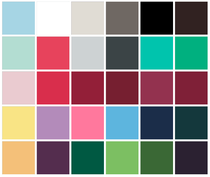
Below are six mini palettes created from the larger palette above- the idea being that one mini might really highlight the person while others could feel lackluster. The first group of four is a stereotype that not every Dark/Deep Winter will wear superbly. It doesn't make you less of a Dark/Deep Winter to wear the very last color grouping best. It doesn't make you a Summer, because the saturation/chroma is firmly Winter, even without emphasizing black, white, and cranberry. Particularly if your coloring is atypical, one of the non-stereotypical mini palettes can create a better overall look, even if your skin can technically handle black, white, and cranberry fine.
6 sample approaches to Dark winter, beginning with the stereotype top left, which will only truly flatter some DWs.
Being thorough in your approach means personalizing the box. Fantastical Beauty has multiple ways of doing this (leanings, subtypes, starting palettes) that are built in. Base 5 and seasonal coloring don't have personalization built in, but you should be doing it anyway. If you're struggling to personalize, consider working with a stylist. What I've said above for Dark/Deep Winter holds true for all of the other seasons in the 12 season approach. It holds true for the 16 seasons system and the 4 seasons approaches. It holds true for whatever color and style systems you are using to help define your own best look. You are handed a box. Tinker with it until it becomes a heart, a star, a diamond, or whatever shape best fits you.