Fantastical Beauty and Use of Personal Coloring in Typing

There are ways to make every personal coloring work with every type (as you see in the guides), but the prototypical image of each of the 9 types is friendlier to some personal coloring than others. The ease of your own best colors meshing with the dominant image of a type might be a useful tertiary consideration for some (particularly for those not looking to do much personalization work).


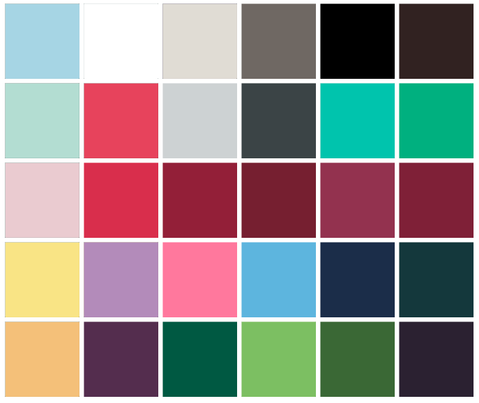
The dominant color schemes are as follows:

Valkyrie: Black and Darks, Neutrals

Fae: Pastels and Icies, Purple

Magic Queen: Black+White and Cool Brights, Red

Maenads: White and Warm Brights, Orange

Nymph: Softs and Warm Browns and Greens

Angel: White and Pastels, Pink, Blue

Dragon Princess: Brights and Gold, Metals

Mermaid: Cool Blues, Greens, Pinks

Seer: Muted Warms, Red, Grey, Green


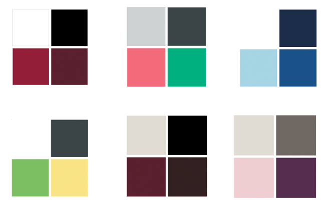
What do I do if my type doesn't easily lend itself to the dominant color scheme of my type? E.G. if I'm an Angel who looks best in dark colors and purple especially, or I'm a Valkyrie but prefer wearing my lightest colors and few neutrals.

1. Schedule a style analysis with me so I can create a unique vision for you that includes a personalized moniker and uses your best colors in conjunction with the particulars of your type.

2. Explore the guide. Each guide shows sample palettes and color combinations for Spring, Summer, Autumn, and Winter coloring.

3. Explore Leanings and Subtypes as a way of better harmonizing a type and coloring together.

4. If you're not interested in personalization/the guides/custom analysis, and the dominant mood of your type and your coloring are opposites, see if another type within your quadrant would work better for you.


How should I use color as a tertiary consideration in typing myself?

Colors (and bust size, stature, personality, etc) are just one tiny tertiary consideration among many for when you are really on the fence between two types. If you are truly on the fence, how close your preferred coloring is to the color scheme of a type might be one of the small factors worth considering as you try to make the call.


How to Wear Unflattering Colors Successfully

I think we've all been seduced by a color that looks bad on us before, and I know all too well that we all have something black in our closet, when it's unflattering on more people than not (and for people to do wear it, they often choose black when they'd be better served by choosing a color). Rather than pretend like we're only ever going to choose our best colors, I've come up with a few guidelines for wearing violation colors and neutrals to help it look less bad

My first recommendation is that you choose a flattering version of whatever color you're lusting after. Wild about hot pink right now but look best in warm muted colors? Try rocking your peachy-pink and see if that takes care of the lusting. Wanting to wear black but your bests are lights? Go for your deepest grey or taupe. If that still fails you, try the following:

Unflattering Colors

  1. Do your best to keep it away from your face.
  2. Keep it small, preferably a really small block. How about a ring? How about lining for a jacket so that there are only small and occasional peeks of the color?
  3. Integrate it in a print that also contains colors that flatter you, still preferably away from your face.
  4. Pair it with your best neutral. If you can pair the violation color successfully with a color that is flattering to you, so much the better, but if your violation color is truly far off from your best, you will probably have to focus on your best neutral. (For the illustrative image, imagine the person who is looking to wear hot pink is an autumn base in their personal coloring)


Unflattering Neutrals

I find that unflattering neutrals are more forgiving than unflattering colors, but don't think that gives you more leeway- I'd generally rather see an unflattering color than head-to-toe solid neutrals on someone, because at least they're trying to be visually interesting (sorry if that felt like a diss... you know I hate *yawn* looks!). 

  1. Do your best to keep it away from your face
  2. If you have to have it near your face, buffer it by having a super flattering color near your face, and in a large block if possible.

I tried to pick a harder example in choosing black near the face for a person whose best colors are light. I echoed a small amount of black in the show to help integrate it- it's a good idea to avoid a floating block of color/neutral when it's a violation color/neutral.

FB Guides Update: COLOR!

In response to requests for more information on each of the 9 Fantastical Beauty Archetypes and the unique ways each of the types approach color, I've greatly expanded the color sections in the type guides. There are now three pages of color information in each guide.

The first page is a longer discussion of the type's color scheme (is it bold or blended or contrasted? are there specific colors to focus on?), with a few notes on subtypes (more extensive discussion on subtype or leanings impact on color schemes and choices will be addressed in their own specific guides or blog posts). 

The second page shows sample palettes for each of four seasonal bases (Spring, Summer, Autumn, and Winter coloring), with four sample palettes shown for each seasonal base (16 total sample palettes). 

The third page shows sample color combinations with two sample outfit color combinations shown for each of the four seasons (8 total sample color combinations shown). 

With these suggestions, you have a lot of guidance to use in application of color to your own wardrobe. As added fun, you can customize and apply color to the ensemble illustrations in each guide for your type. You can print out the pages and try your hand at coloring in the outfits using your own best versions of the colors to see how it might look. You can add in your own best prints if you're feeling artistic.


Other updates: For now I've removed the Paypal buttons. You can still use Paypal, but rather than a button, email me with what you'd like to order (products/services), and I will create an invoice and send it to you. Checkout using a card is still available site-wide.  

If you previously purchased a guide and are itching to get your hands on the updated version with detailed color ideas, for a limited time only I’ll update yours for $5 per guide. Email me with your details to take advantage while you can.